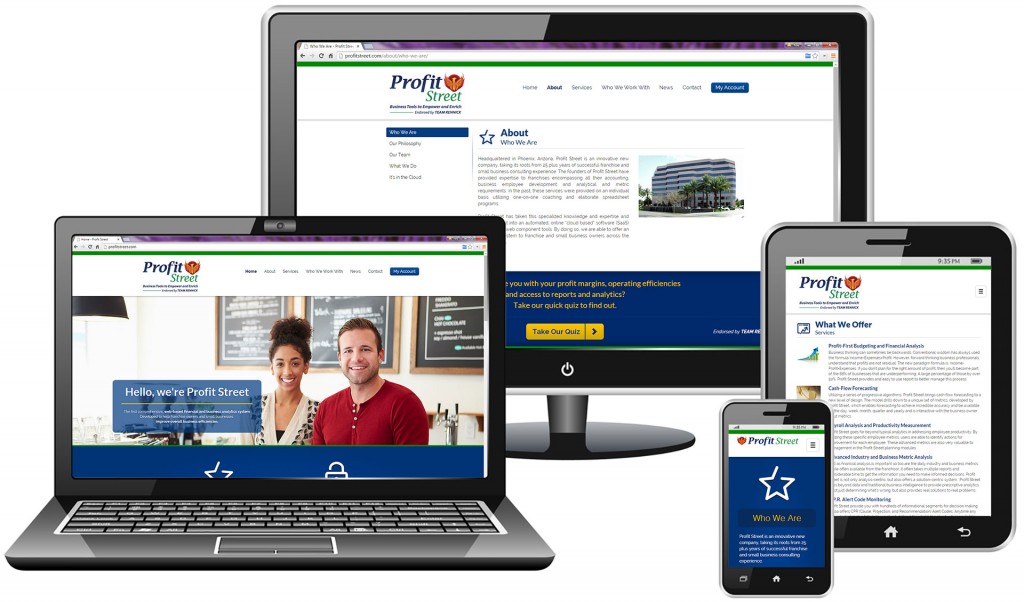
Responsive website design
Brand identity and logo design
![]()
Logo Usage
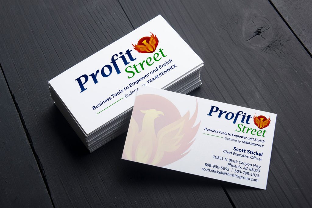
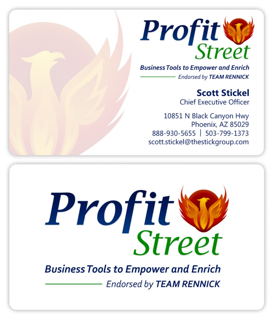
The logo was designed to display on a white (or very light) background. For example, the logo is well suited for business cards and letterhead. Depending on usage, alternate color variations can be used but it’s encouraged to place the logo on light backdrops. It is acceptable to use the phoenix icon without the logo and the logo without the icon.
Fonts and Typography
The logo was designed with Lucida Bright italic fonts. The tagline font is Corbel bold italic and the business card uses Ebrima bold and regular. Additional weights and variations of Corbel and Ebrima are acceptable.
Copy and Headline Fonts:
- Corbel Italic
- Corbel Bold Italic
- Ebrima Regular
- Ebrima Bold
Color Palette:
The primary Profit Street brand color is deep blue (a “reliable” brand color motif). All other brand colors are supplementary. Because the logo includes 7 unique colors, it’s important to emphasize a “blue-first” mentality when creating marketing materials. Green and gold are appropriate accent colors. The warm colors are encouraged for hard contrast or call-to-action elements. A light gray can be used liberally to add a neutral, professional tone.
- Deep Blue
- Blue
- Green
- Dark Red
- Red
- Gold
- Light Gray
Business card design