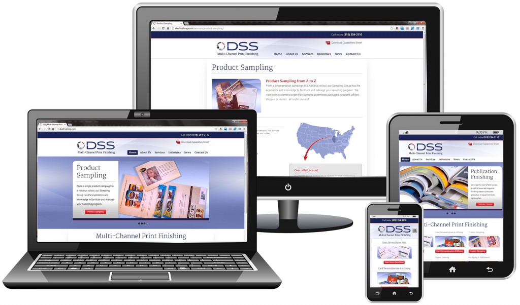
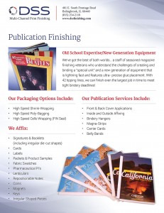
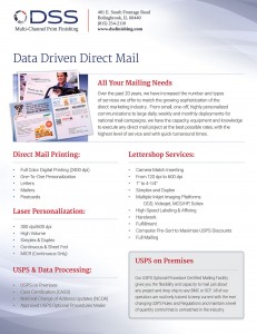
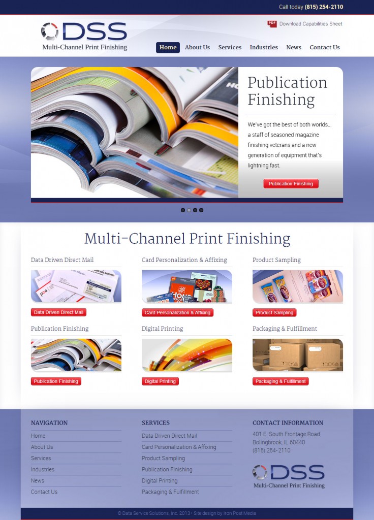
Responsive website redesign
Business card design
Design notes
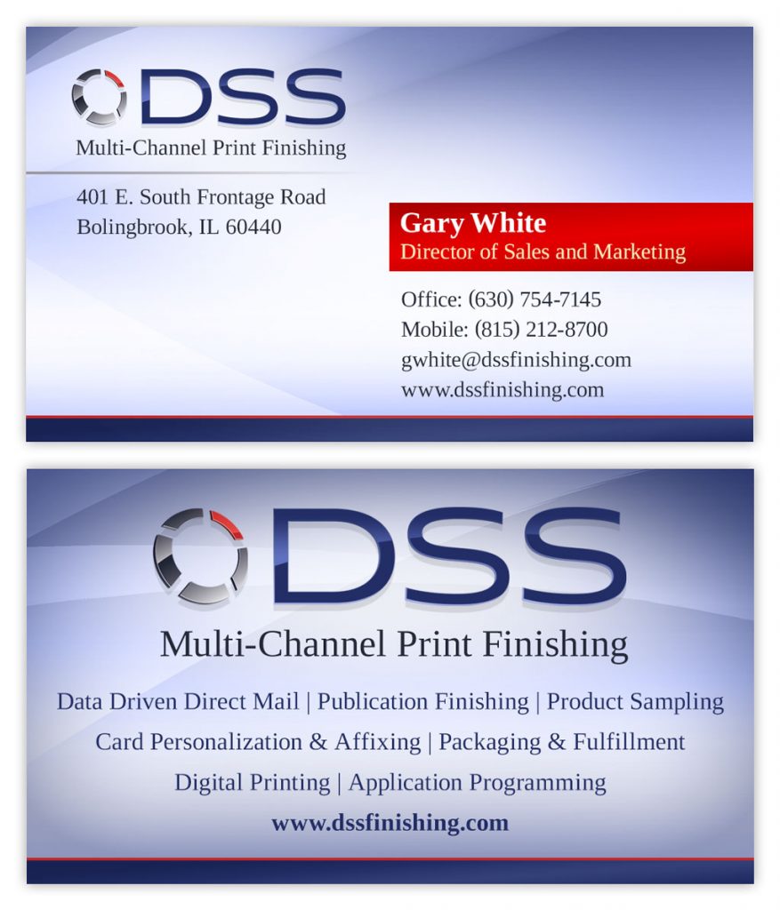
This design is successful because it’s straightforward AND abstract. What a combo.
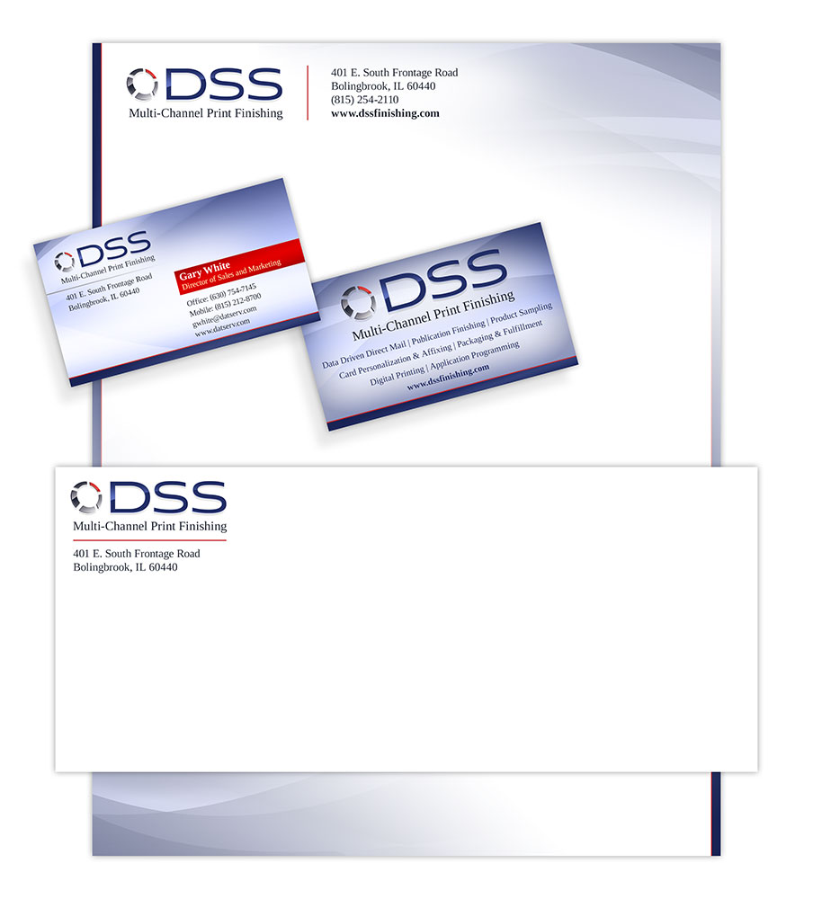
Here at Iron Post, we’re fans of the obvious. Especially when your business does some really rare stuff. Does “Multi-Channel Print Finishing” mean something? Yes. Does it mean something to you? Probably not. That’s why listing out their services is the perfect compliment. Why not add some clarity to your brand identity pieces?
Beyond that, we added some intersecting diagonal arcs to visually represent the multiple channels. It’s a fun way to reinforce the service variety without being too literal. Keeping the color variety low ensures that the design doesn’t get too busy or visually confusing.
Business suite design
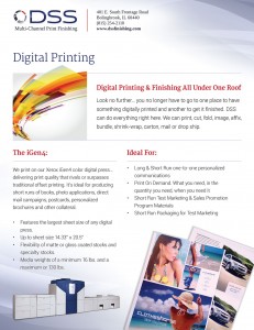
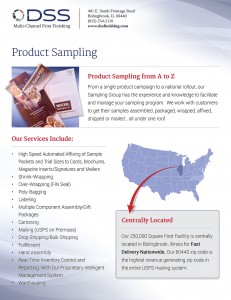
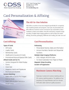
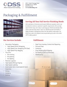
Sales sheet design
Brand awareness marketing design
Project summary
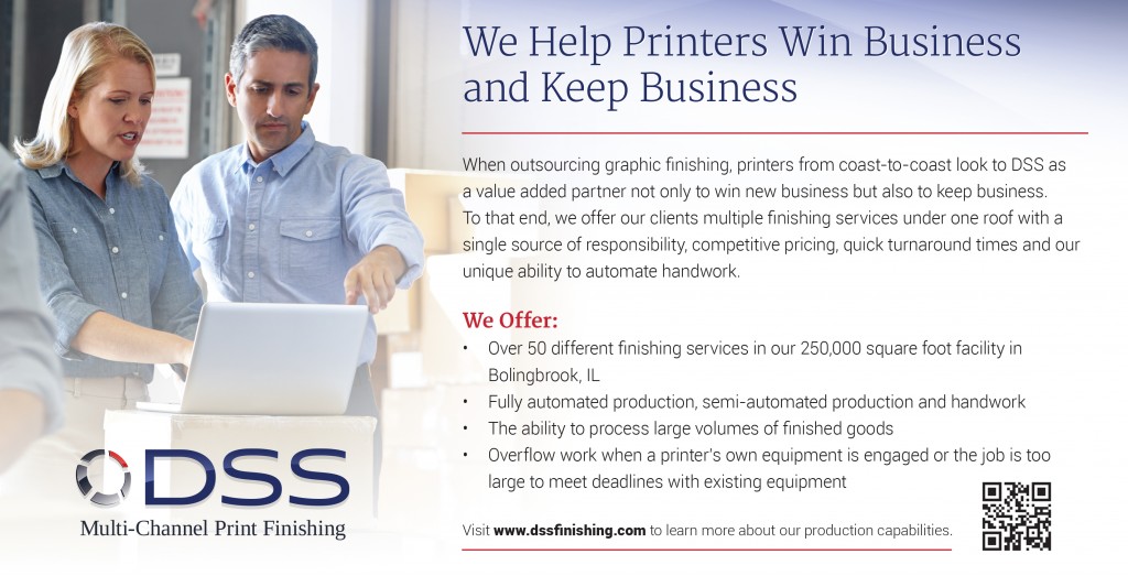
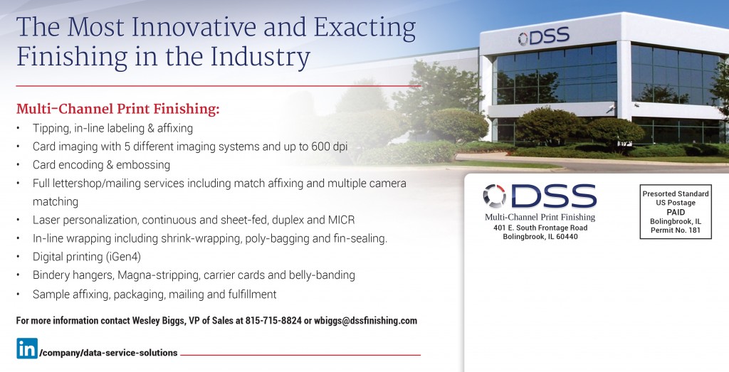
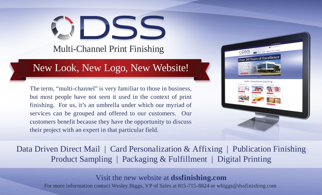
The purpose of this piece was to announce the client’s website redesign (which we also designed). We decided to take elements from the website and use them in the printed piece to reinforce the new look.
This project worked well for our client because it was a legitimate reason to touch base with their existing clients. It’s basically a brand awareness piece and was very successful in communicating the new site and introducing the new brand elements.
Direct response marketing design
