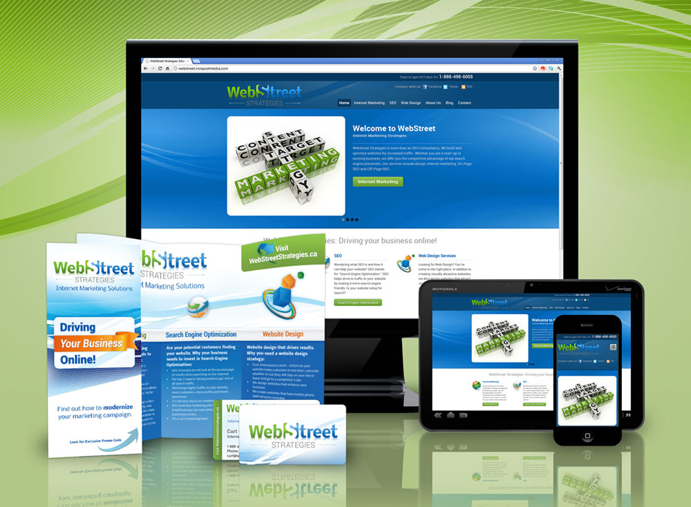
Responsive WordPress website design

Business card, logo design, and branding

Design notes
This card design just came out nice. It looks great. It features an analogous blue-green color scheme that sits really well on the white background. Clean, fresh and modern.
There isn’t any specific brand messaging (which we usually don’t recommend) but the card stands well on visuals alone. The prominent logo adds to brand recognition when you visit their website or see other brand identity pieces.
Normally we’d recommend some brand messaging – but when it’s this pretty you just let it ride.
Business suite design

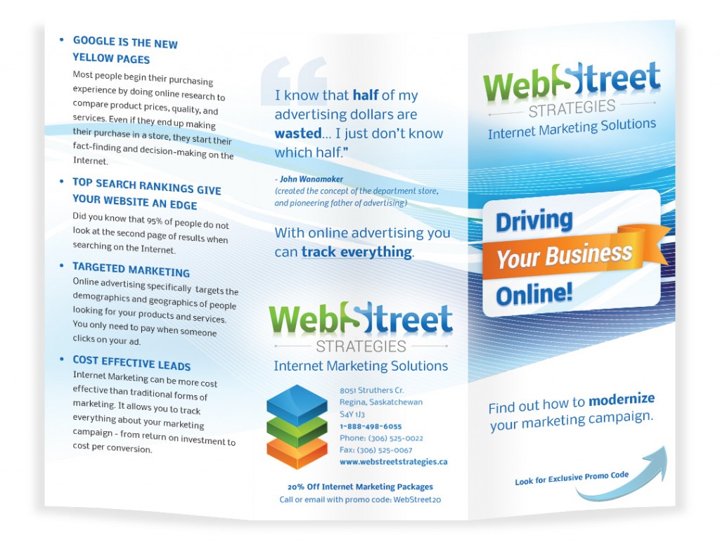
Brochure print marketing design


