Product display signage design

Design Notes
This is a 20-inch product display sign that sits above a product sample at trade shows. Beyond its basic function as a sign, it prominently features a simplified version of the logo. In addition to the simpler version, the more ornate “housing” version sits in the bottom left.
The purpose of the simple version is to speak to larger companies. A lot of corporate identities have relatively simple wordmark logos. Showcasing a wordmark version of the PREVCO logo helps align their brand with larger corporations in the subsea fields.
The simpler logo is the same font and relative size as the housing version (the outer bevels are combined to the inner line width to add some visual weight to the wordmark version).
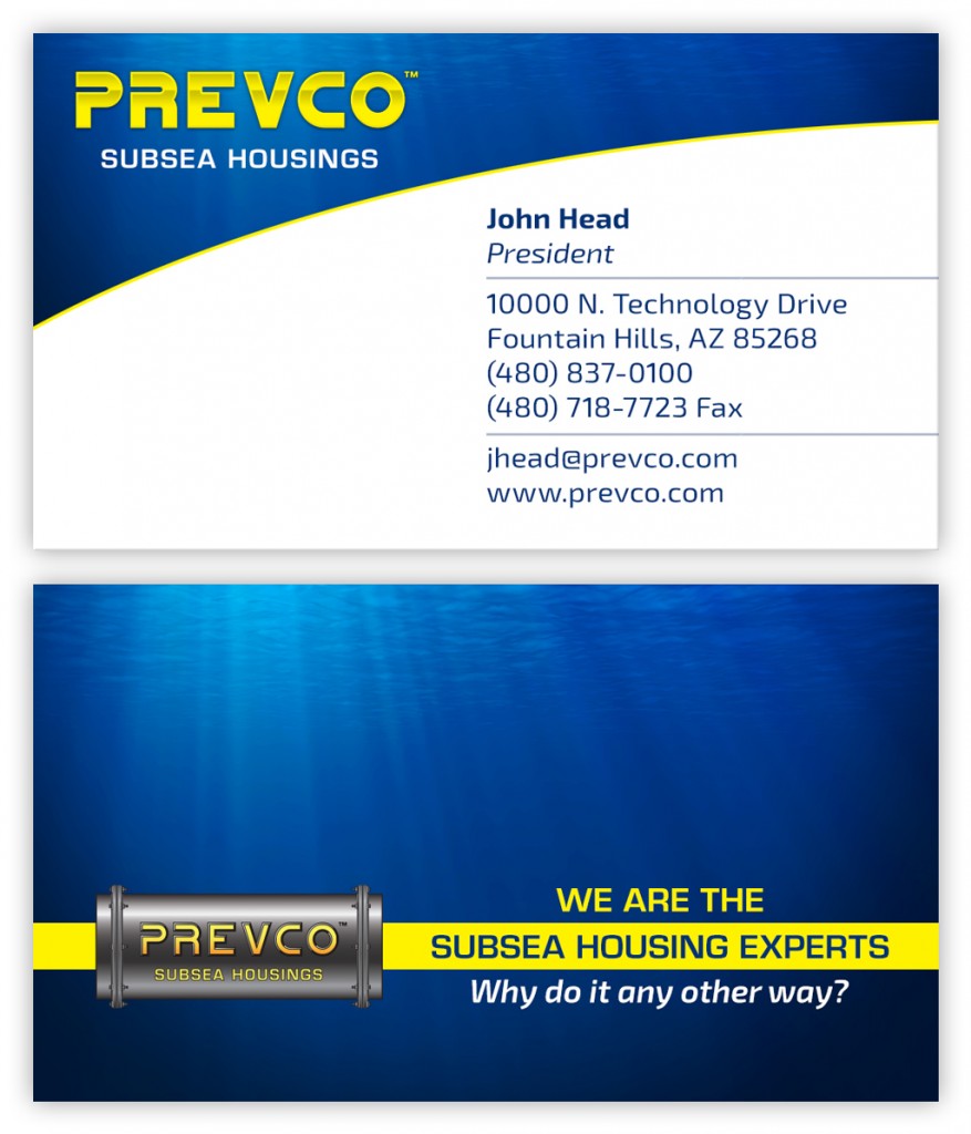
Business card design
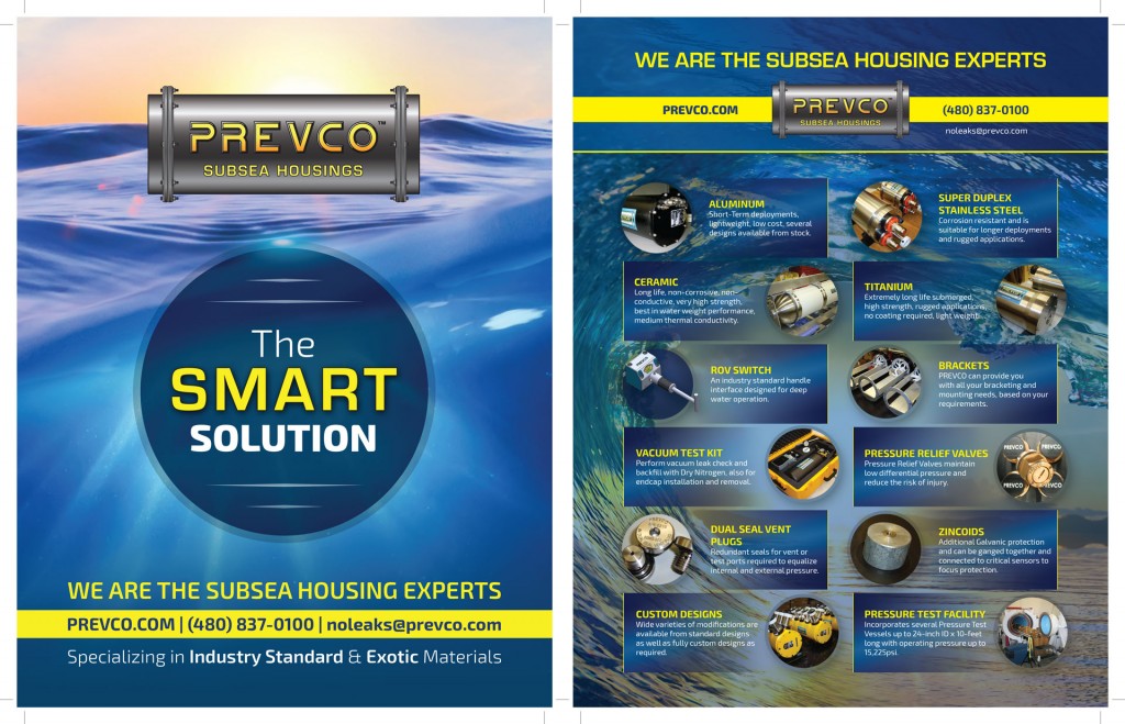
SeaTech Magazine ad design
SeaTech Magazine back cover design layouts
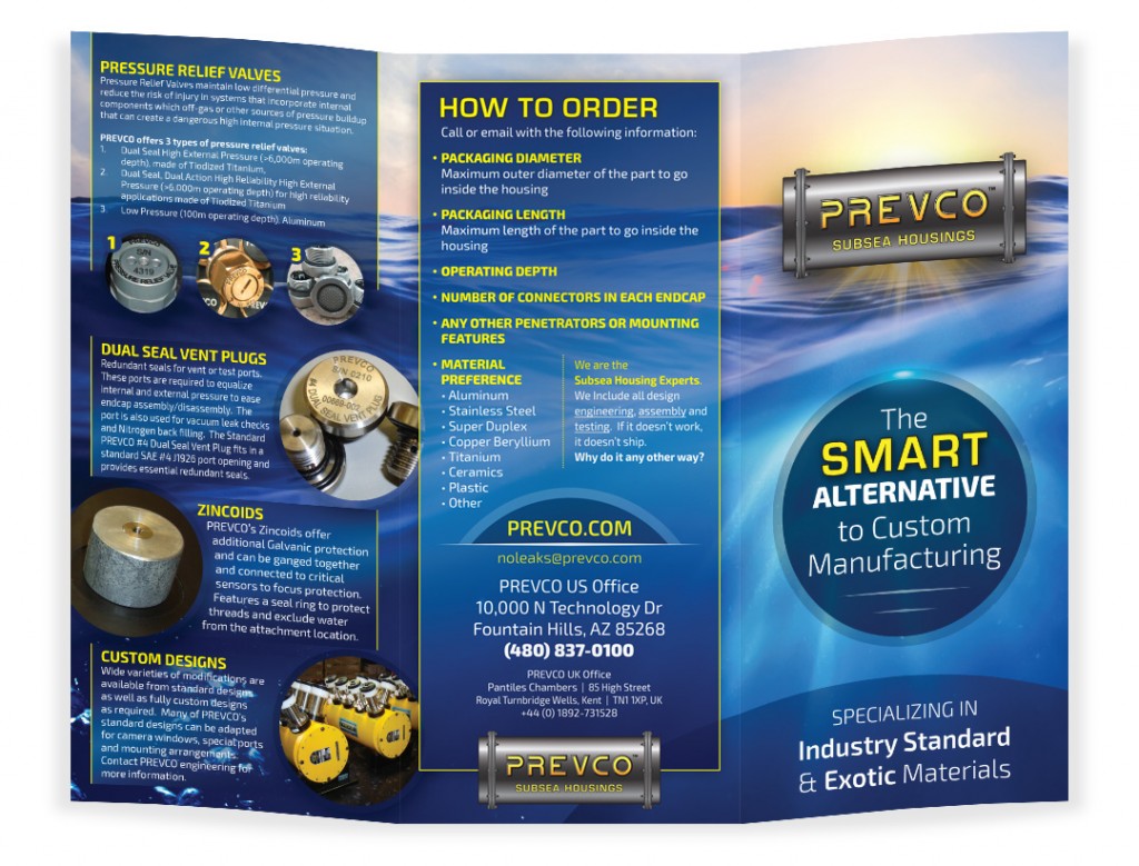
Tri-fold brochure design
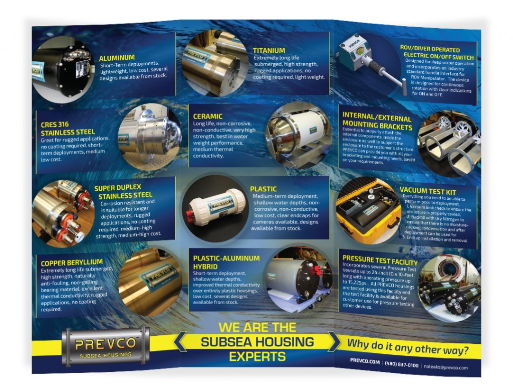
Design Notes
This brochure works well as a mini product catalog and brand identity piece. We decided to incorporate circles into PREVCO’s branding because most of their products are cylindrical. Adding repeated design elements based on product characteristics is a strong way to reinforce the brand.
The large spiral wave has a nice circular shape. We were careful to add circles and arcs to each panel. The result is a warmer, organic feel that compliments the industrial products and gives added visual interest.
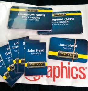
Product display cards design
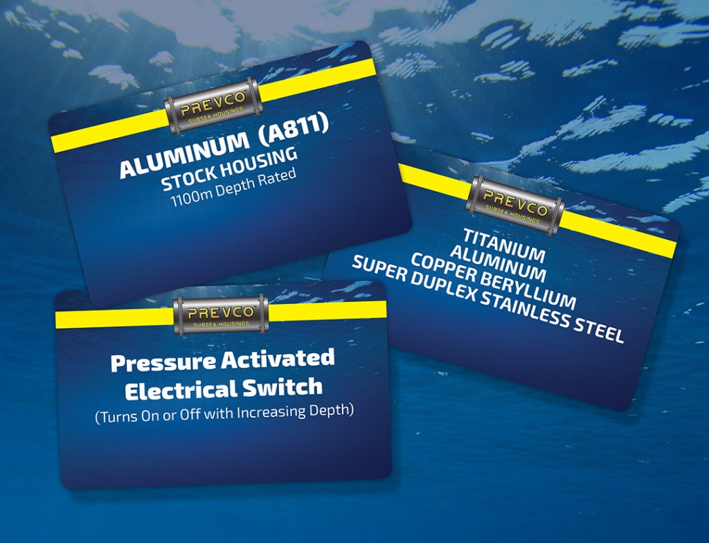
PREVCO Subsea LLC uses product display cards that match the rest of their printed marketing pieces (reinforcing their brand identity and building familiarity for their customers).
Design Notes
These cards are used at trade shows for product displays. They’re propped up in little stands in front of various product samples. Prior to these branded cards, PREVCO was using a white index card with only the product name and no branding.
The new cards add a brand identity element to each product at the trade show. This increases brand awareness and reinforces other printed pieces. The rounded corners are a subtle touch and they add to the perceived value of the displays (and by extension the products themselves). The designs are printed on heavy card stock and laminated – so they feel sturdy to the touch – and they’ll last a long time.
PREVCO puts together a very nice booth for their trade shows and these product display cards, along with additional signage, help to reinforce their established brand identity.
Rack card inserts design

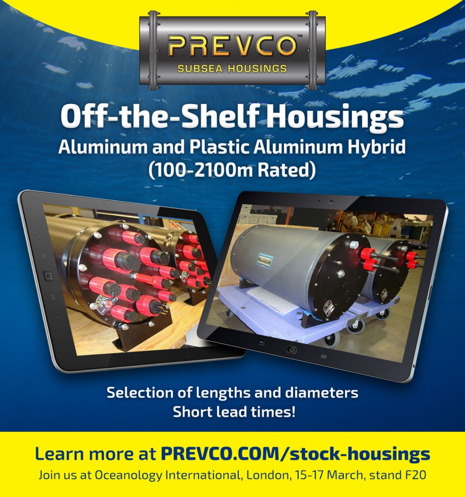
Email marketing design