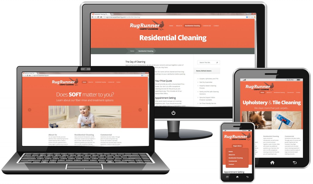
Responsive website design
Business card design
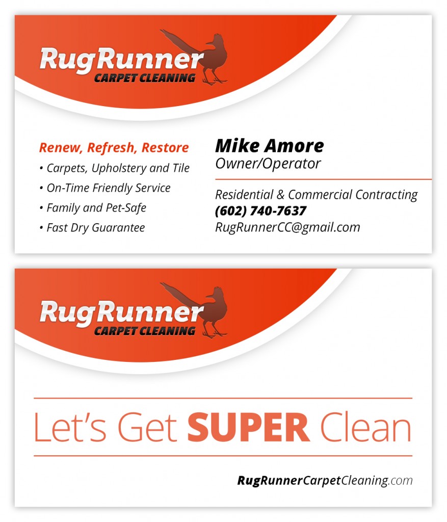
Business card design notes
This card design has a lot going for it. Not only visually, but on the marketing side as well.
The color simplicity allows the brand identity to stand out. There’s no doubt that you’re dealing with an orange theme. It’s recognizable and easy to identify when you see it again. Bold simplicity always cuts through the clutter.
The marketing messaging is also very good. There’s a fun catch-phrase slogan, “Let’s Get SUPER Clean” – as well as a list of promises and services. The card is communicating a lot of information in a clear direct way.
Direct mail marketing design
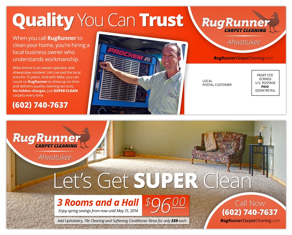
Direct mail marketing design notes
This project is interesting because it’s secretly a brand awareness piece.
We designed the brand identity for RugRunner and it’s fun to see the elements come together. The $96 offer is nice, but what really makes this work is the messaging. We weren’t shy about using the words “Quality” and “Trust” in close proximity to Mike’s photo and the RugRunner logo. We mail this piece to a relatively affluent neighborhood and felt it was important to establish trust (rather than throwing a bunch of noisy offers at the audience).
The piece has been successful on its own, but it also works nicely to reinforce other RugRunner brand identity elements (business cards, website, van decals, social media, etc).
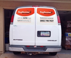
This mockup illustrates the placement of window decals. As you can see, the phone number is prominent as well as the slogan, web address and brief service description: good bang for the buck.
Decal design notes
These van window decals work well to reinforce RugRunner’s branding.
RugRunner is a very small carpet cleaning company. It’s important to them to be perceived as trustworthy by their customers. A cohesive, consistent brand package gives RugRunner the professional impression that they’re looking for. In addition, professional branding adds to the perceived value of their services.
The decals are very similar to RugRunner’s business cards, website and Facebook page. The consistency helps customers feel confident that they made the right choice by hiring a professional company they can trust.
