Sometimes simple works best
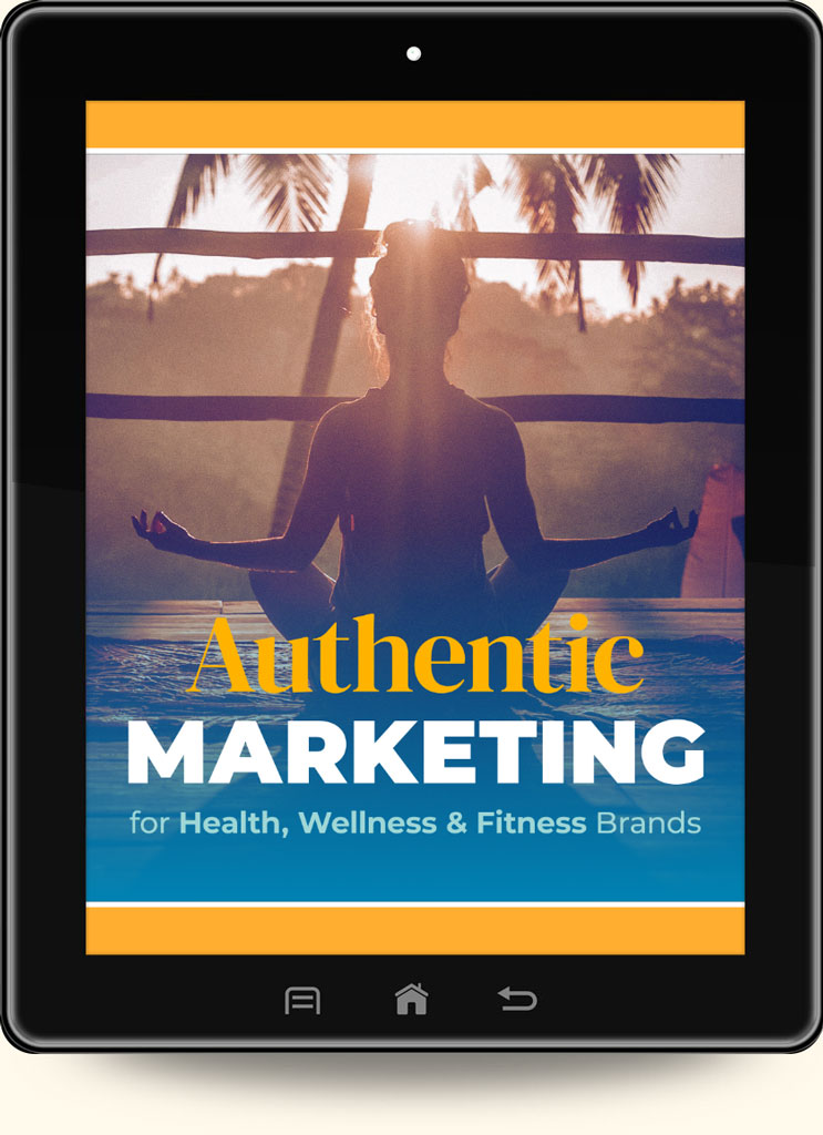
This was a quick-turnaround design project for my client Reas Marketing in Florida.
I chose the teal/blue gradient background color because it closely matches the client’s main brand color scheme. The orange and yellow focal point stands out because of color contrast and simple geometry. It’s a rather basic design but works well because of the high contrast.
I selected Avant-Garde for the font because it’s the same font we use on their blog banners. I felt like consistency across media was more important than finding a font with more visual appeal.
#digitalmarketing #visualdesign #ebookcoverdesign


