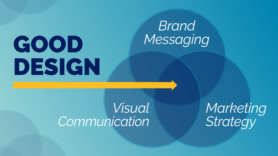
What is good design? Isn’t design quality subjective?
For the most part, I think graphic design quality is subjective. But it’s something anyone can recognize at the extremes. Design tends to stand out when it’s good (and also when it’s garbage).
When you recognize good design, you’re rarely noticing traditional design elements. Fundamentals like typography, color, texture, visual hierarchy, and shape don’t necessarily translate to outstanding design. When good design catches your attention, it’s typically the execution of an idea.
Good design communicates something richer than the visuals. How’s that for an abstract concept? But the takeaway is that you can improve your design execution with a little strategy. I’ll get into the actionable ideas in a bit, but let’s look at what not to do first.
Form follows function
From my experience, bad design strategies stem from the lack of an underlying message. In other words, relying too heavily on visual interest and surface-level information. You can define bad strategy like this: focusing on aesthetics before you understand what they should mean.
Aesthetics-first is a weak design approach. It’s a recipe for mediocre, cookie-cutter results. This is a rut that keeps the average designer locked in perpetual career limbo. So it’s best to focus on the message and meaning first. Then you can dig into what something eventually looks like.
The main problem is that non-creatives who hire professional designers tend to start with graphics they like. That’s often where their vision comes from. They reference specific websites, layouts, colors, and fonts that they want to emulate. This perpetuates the world of shallow design concepts we see all around us.
Another issue is time. A good percentage of designers don’t put in the time to understand the message before getting started on graphics. When requirements revolve around imagery, it’s easy to jump into design mode and neglect a deeper understanding.
Why does any of this matter?
Graphic design makes an impact because it can communicate incredibly rich, layered messages. There’s a difference in depth between highly strategic, professional work and interesting visuals that simply catch the eye.
You don’t just want eyeballs, you want your audience’s full attention. Good design can do that. Here are some things to keep in mind before picking color swatches and searching for the perfect font combinations:

Brand messaging
Brand messaging is essentially the vocabulary your business uses to communicate its core attributes. Very few businesses have a written brand messaging framework. So if you’re working on a design project, it’s unlikely that someone will provide you with a brand vocabulary.
But it’s not that difficult to infer messaging from other published designs. A company’s Home page probably has a lot of messaging that you can work from. Sales sheets and brochures are more good sources of brand messaging. A five-minute conversation with the CEO will also work nicely.
Can you find three to five unique words or phrases that help define and differentiate the company you’re working for? Do these unique words conjure any ideas for imagery? Can they reinforce your design direction?
Marketing strategy
Marketing strategy is a deep topic. But there are some fundamentals you can safely reference for just about any commercial design project.
In general, a marketing strategy that focuses on being deliberately different will be successful. Contrast is your best bet. But you can’t create contrast and stand out if you don’t understand your customers and competitors.
- Offer: Do you understand the offer on the table? Can you communicate the value beyond the financial transaction?
- Objections: Why wouldn’t the ideal customer be interested? Can your design face objections head-on to help persuade the audience in your favor?
- Alternatives: What alternatives are people already taking? Have you done the market research to know what competitors are doing?
- Solutions: How is your offer solving a problem? How is it unique?
- Desire: Are there any basic human desires that are relevant to the offer? How can you motivate people to take action based on these desires?
- Mood: What emotions are involved?
Visual communication
With brand messaging and some marketing strategy in hand, you now have ammo for your graphics. But it’s still too soon to start the visual design process. There are a couple more things to consider before locking in your direction.
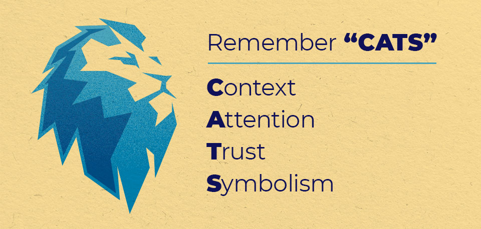
- Context: Your first design challenge is orienting the audience. Your design won’t work if people don’t understand the message. The best way to orient your audience is through imagery that adds context to the overall message. Just because something is pretty or interesting doesn’t mean it serves the message. How can the first impression help people understand the message?
- Attention: After you’ve provided some context, you can get creative. This is where the visual interest comes into play. Notice how late in the creative process this is. There are so many ways to grab attention when you understand the brand and marketing strategies.
- Trust: Anything you can do to reinforce trust is a bonus. Authentic images of real people are a great place to start. Bolstering credibility and trust will help the effectiveness of just about any design. Design 101: There’s nothing like well-executed design fundamentals to add trustworthiness to a design. People trust professional aesthetics.
- Symbolism: Are there any known symbols that you can incorporate into your design? You don’t want to get carried away with cliches, but sometimes using symbolism adds a useful layer of meaning. And sometimes it’s overkill. At this stage in the game, you know whether or not clever additions will help or hinder your project.

You can’t see strategy
Hopefully, I’ve introduced you to at least one new way of looking at graphic design. If the strategic approach is new to you, try narrowing your options. It’s better to execute one of these ideas than to force too many messages into one design.
With experience, you’ll be able to wrap more of these concepts into your copywriting and design direction. Keep in mind that rich, conceptual strategy doesn’t require equally rich aesthetics. Less-is-more is still true when it comes to executing any design strategy.


